When I joined Bankjoy, our brand struggled to differentiate itself in the competitive fintech marketplace. The company itself was a small, scrappy startup, and facing a true "David vs. Goliath" branding challenge against its peers.
Directly tasked by the CEO, I set out to elevate Bankjoy’s visual identity and storytelling, clearly communicating our core values—trust, innovation, and community engagement—in ways that resonated with our target audience: community banks and credit unions.
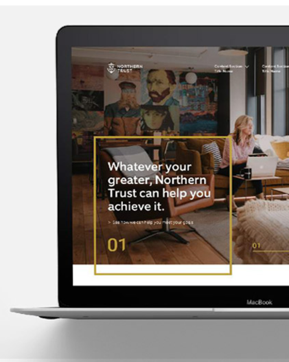
The overarching goal was to create a distinctive brand identity, visually and strategically aligned with premier fintech brands like Stripe, and to position Bankjoy as an unmistakable industry leader.

As Lead Designer and Brand Strategist, I was responsible for the end-to-end creation and full-scope execution of Bankjoy’s new branding and visual guidelines. This included competitive research, strategic executive workshops, creative direction, and comprehensive design execution across all facets of branding, including digital, print, and experiential.
As typical of an ambitious startup environment, I had limited resources and served as the sole designer and creative lead for the project, collaborating closely with the external website developer as-needed, and receiving strategic feedback from our Marketing Executive to ensure alignment with the executive team's vision. My role required extensive collaboration across executive and product teams, resourceful decision-making, and clear strategic communication to deliver a cohesive, impactful outcome.
The creative solution emerged from carefully balanced storytelling.

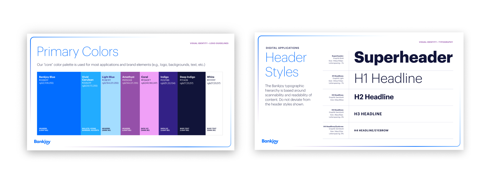
A fluid, dynamic gradient became the central visual metaphor—its depth and ever-shifting hues illustrating Bankjoy's adaptability, versatility, and forward-looking innovation. Deep, resonant blues within the gradient emphasized foundational trustworthiness, communicating reliability and stability. Complementary purple highlights carved a distinct visual niche, differentiating Bankjoy from competitors and reinforcing our innovative spirit at tradeshows and across digital touchpoints.

To anchor these organic gradients, precise geometric forms were thoughtfully introduced. These sharp, clearly defined elements visually reinforced solidity, stability, and reliability—a crucial balance against the ethereal fluidity of the background gradient. Rich, sweeping arcs subtly illustrated the essence of togetherness and community, visually weaving through the compositions, connecting disparate elements into a harmonious, cohesive whole.
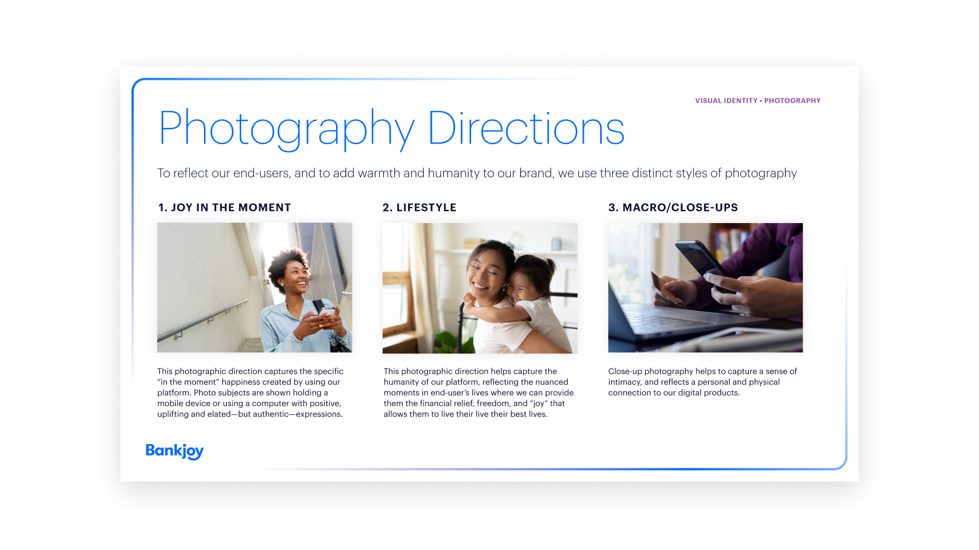
Finally, detailed imagery and photography guidelines reinforced themes of joy, authenticity, and community engagement, illustrating three distinct emotional connections between users and the Bankjoy platform. Moments depicting genuine joy, candid experiences of ease, and quiet comfort were carefully selected—portraying authentic interactions between users and Bankjoy across multiple devices, thereby highlighting the platform’s adaptability and intuitiveness.
This careful curation visually reinforced our brand promise: creating meaningful, joyful experiences through intuitive banking.


The rebranding successfully positioned Bankjoy prominently within the fintech industry, significantly improving our brand recognition and client engagement across multiple channels. Measurable outcomes included:
This flagship branding initiative underscored the power and necessity of strategic clarity and compelling storytelling in visual design. Successfully aligning diverse executive stakeholders taught me invaluable lessons about articulating brand strategy, creatively managing limited resources, and consistently demonstrating design’s tangible business value. The experience further refined my capabilities in strategic leadership, communication, and design direction, reinforcing the critical role of cohesive, thoughtful branding in achieving significant business outcomes.
"Love the designs. You've really taken our branding to the next level. I remember when I was interviewing you I said I wanted our brand to be as distinctive and aesthetically on par with Stripe, and you've done it." — Mike Duncan, Bankjoy CEO

.jpg)
.jpg)
.jpg)
Ready to launch
your next
big idea?